Choosing Paint Colors That Bring Out the Best in Austin Homes
Color on a wall never looks like it does in the store. Austin’s light changes everything. What looks subtle in a sample can turn loud or dull at home. Skip the tiny paint cards and test real swatches on your walls. That’s how you avoid a color you’ll want to cover up in six months.
Austin homes don't follow a template. Natural light pours through oversized windows. Open floor plans mean one color choice bleeds into three rooms. An exterior that fights with the street or the landscaping? It sticks out. Good color decisions make spaces feel larger, brighter, and like they were planned that way. Bad ones? You notice them every single day.
Light Changes Everything
Sunlight in Austin isn’t gentle. South-facing rooms get hammered with warm light all day. North-facing spaces stay cool and muted. A color that looks soft in the can can turn blinding or flat once it’s up. Test paint on the actual wall, not just a card. Check it in the morning, at noon, and in the evening. If it still works, you’ve found your color.
- Lighter shades open up small rooms and make ceilings feel higher. They work especially well in homes with limited square footage.
- Matte and eggshell finishes absorb light and hide wall flaws. Satin and semi-gloss bounce light around and wake up a space.
- Warm whites and soft grays thrive in rooms with lots of natural light. In dim hallways or windowless bathrooms, they can look lifeless.
- Darker tones add drama and coziness. Without lighter trim or furniture, they shrink a room fast.
Plenty of homeowners fall for a color online, then regret it once the sun hits. Our interior painting team in Austin always tests in real conditions. Paint a few feet, live with it, and watch it shift. That’s the only way to know it’s right.
Palettes That Work in Austin
Modern, rustic, mid-century. Austin neighborhoods cover it all. But some palettes keep showing up because they just work. Warm neutrals: greige, taupe, soft beige. These never fight with natural wood or stone. They’re flexible and timeless. They don’t demand attention, but they never look dated.
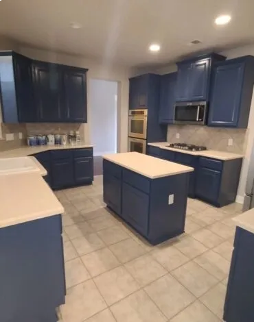
Desert-inspired colors: terracotta, sage, dusty rose, clay. These bring in a Southwest feel without going overboard. These shades pair with Austin’s outdoor vibe and age well. Soft blues and grays show up in contemporary homes, especially with white trim and black accents. They feel clean and current, never cold. Deep greens and charcoal are back for accent walls and dining rooms, but only if the rest of the space can handle the weight. When you want a home that flows, our residential painting service builds a palette that moves naturally from room to room.
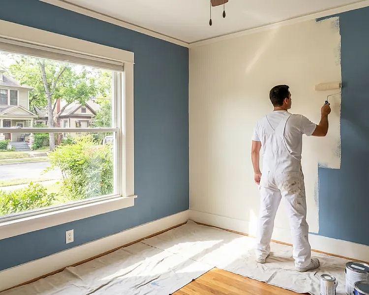
Trim and Accent Choices
Walls don’t stand alone. Trim, doors, baseboards, and crown molding frame every room. If they clash, the whole space feels off. White trim is the safest move. It brightens, sharpens, and works with almost any wall color. But not all whites are equal. Some lean blue, some yellow, some just look dirty next to the wrong wall. Test them together before you commit.
- Bright white trim pops against dark walls and creates crisp lines. In softer rooms, it can feel too stark.
- Off-white or cream trim feels relaxed and pairs with earthy or neutral walls.
- Matching trim to walls in a slightly lighter shade creates a seamless, modern look. This is especially true in open-concept homes.
- Accent walls should be one or two shades deeper than the main color. High contrast only works if you want a bold statement.
- Black or dark gray trim is bold and modern, but needs strong lighting and a confident design to work.
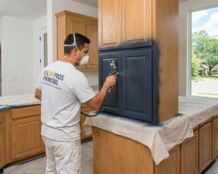
Many homeowners pick a great wall color, then use leftover white for trim. It rarely matches. The room feels unfinished. When updating trim or investing in our cabinet painting refinishing, make sure every element works together. Coordination pays off every time.
Flooring and Furniture Matter
Floors and furniture set the tone. Paint needs to work with what’s already there. Warm, honey-toned hardwood pairs with neutral or earthy walls. Cool gray or whitewashed floors need walls that won’t clash: soft grays, whites, or muted blues fit the bill. Tile in kitchens and baths sets the direction. Beige tile? Go warm. Gray tile? Stick with cool or neutral. Heavy, dark furniture? Lighter walls keep the room from closing in.
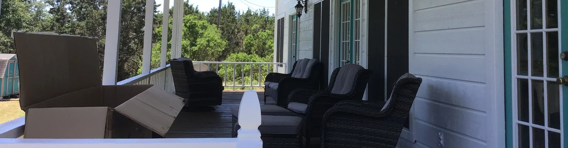
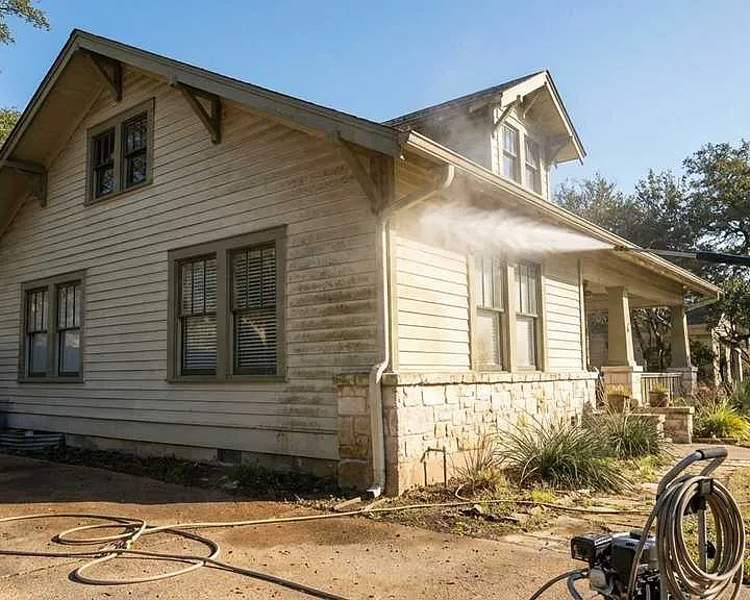
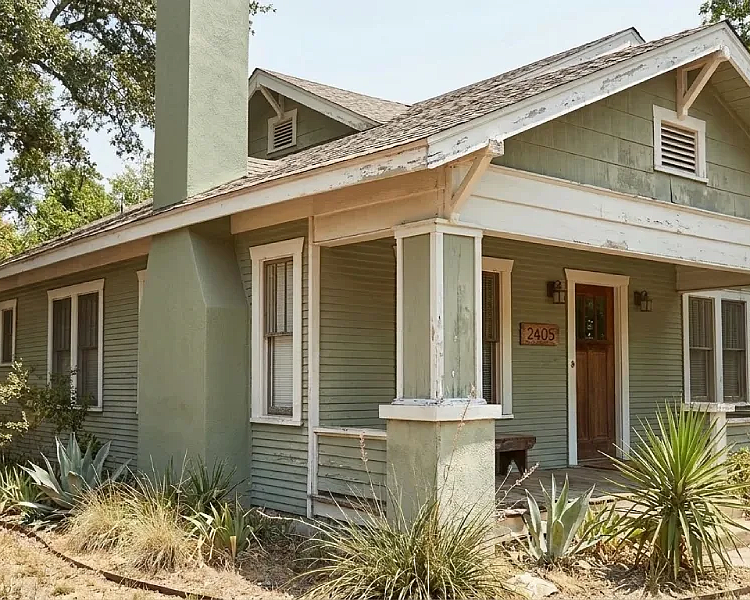
Exterior Color That Fits
Exterior paint does more than look good from the street. It has to work with what's already there. Austin's architecture swings from classic bungalows to sharp modern boxes, so your color choice needs to respect the bones of the house. Lighter shades reflect heat and require less upkeep. Darker tones pop but fade faster and pull in more sun. Got stone or brick? Lift a color from those surfaces for trim or shutters—it creates cohesion. Heavy landscaping? Warm neutrals and earth tones play better than anything loud or icy. When we handle a full exterior refresh, our exterior painting team factors in the neighborhood and natural elements, not just what's trending.
Finish Makes the Difference
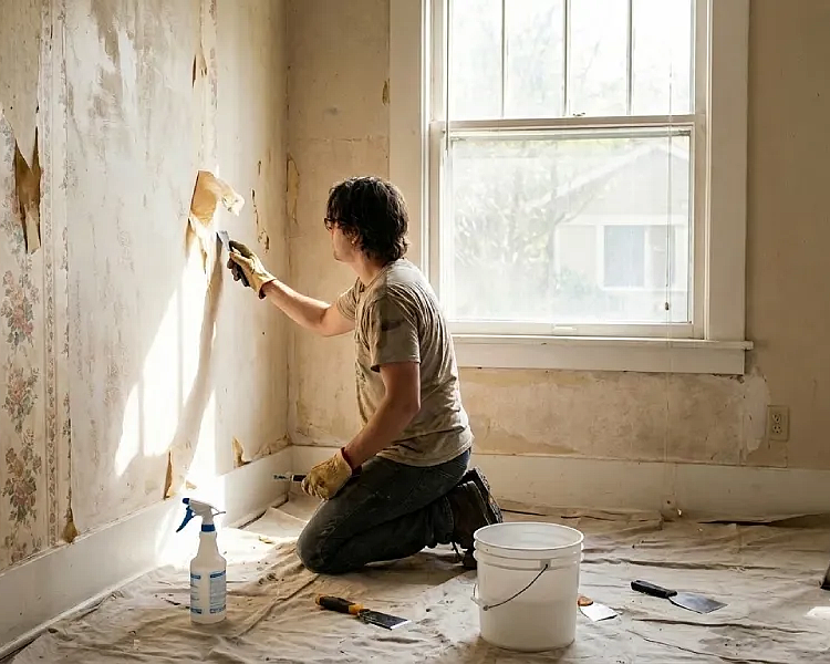
The finish you pick determines how the paint holds up, not just how it looks. Flat and matte coatings mask wall flaws and deliver a muted aesthetic, but they fold under pressure—one scrub and you're looking at damage. Eggshell and satin offer a low sheen that can handle traffic, making them the right call for bedrooms, living rooms, and hallways. Semi-gloss and gloss are workhorses. They survive kitchens, bathrooms, trim, and doors because they're built to be wiped down repeatedly. The downside? They broadcast every imperfection on the surface. If your prep work is sloppy, glossy finishes will make sure everyone knows. Walls with texture problems or visible damage? Our drywall repair patching team handles that before we open a paint can. Slapping color over a bad surface just highlights the mess.
- Flat finishes work best on ceilings and low-traffic walls for a soft, non-reflective look.
- Eggshell is the go-to for most interior walls. It’s easy to touch up and forgiving.
- Satin adds glow and stands up to busy spaces like hallways and kids’ rooms.
- Semi-gloss is ideal for trim, cabinetry, and anywhere fingerprints or moisture show up.
- High-gloss is bold and dramatic, but best for doors, furniture, or accents. It’s not for full walls.
Choosing finish isn’t about what’s trendy. It’s about what works for your life. Kids, pets, heavy traffic? Durability wins. Walls with history? Start with our popcorn ceiling removal or surface prep. That’s how you get a finish that lasts.
Work with Austin Painters Who Get It Right
Choosing colors is step one. Getting them on the wall correctly is what actually matters. Sharp edges, consistent coverage, a finish that doesn't quit after six months—that's the difference between a paint job and a professional result. Kolor Pros Painting handles cabinet projects in Austin with the kind of precision that shows up in photos and holds up in real life. One room or the whole house, we don't guess. Call 512-677-2397 or reach out online to start your project.
‹ Back
Recent Posts
-
-
-
-
Can Interior Painting in Austin Help Brighten Small Rooms?
April 30, 2026
-
How Often Should You Repaint Your Austin Home Exterior?
April 16, 2026